

Walk down any supermarket aisle and count how many products you actually look at. Not many, right? Most of the shelf is a blur. The few that catch your eye do it fast, and tell you what they are before you've really thought about it.
That's the job of packaging. It isn't there to look nice on your laptop screen. It's there to win a tiny contest, over and over, against everything sitting next to it. We've designed packs for big brands and small local makers, and the rules are pretty much the same for both.
Design for the shelf, not the screen
The most common mistake we see is packaging that's been judged in isolation. On a big monitor, zoomed in, with a nice gradient behind it, almost anything looks good. On a shelf, under fluorescent lights, a metre and a half from someone's face, sitting between twenty competitors, it's a different story.
So before you fall in love with a design, test it the way shoppers will see it:
- Print it at actual size and stand back a couple of metres.
- Put it next to the products it'll compete with (buy a few and line them up on your kitchen bench).
- Look at it on your phone, small, the way it'll appear in an online store.
- Squint. Whatever still stands out is what people will notice first.
If your pack disappears in that test, no amount of fine detail up close will save it.
Know what you want people to see first
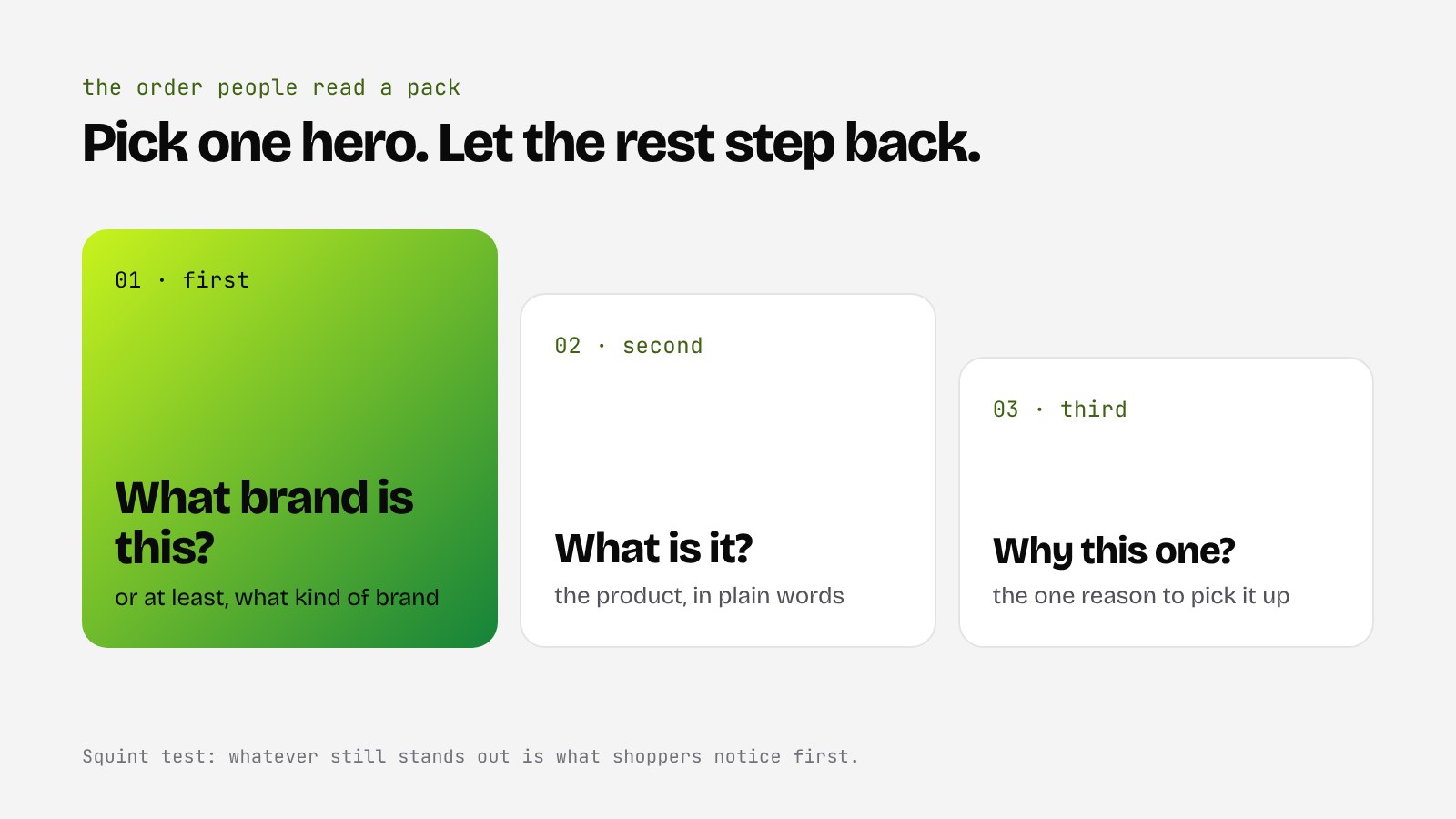
Every pack has an order in which people read it, whether you planned it or not. Ideally it goes something like this:
- What brand is this? (or at least, what kind of brand)
- What is it?
- Why should I pick this one?
Trouble starts when everything shouts at once. Huge logo, huge flavour name, a starburst, three badges and a tagline, and the shopper looks somewhere else.
Pick one hero. Usually it's either the brand or the product name, and everything else steps back. Being brave about what you leave off the front is one of the hardest calls in packaging, and one of the most useful.
Own something
Think about the products you can spot from the other end of an aisle. Often it's not the logo you recognise, it's a colour, a shape or a pattern. That's what we mean by owning something.
For a small brand, owning a whole colour across a category is a big ask, but you can still own a distinctive combination, a bold illustration style, an unusual typeface or a particular way the label wraps the bottle. The goal is that, after someone's bought you once, they can find you again without reading a thing.
A quick way to check: look at your category and note what everyone else is doing. If every olive oil on the shelf is dark green glass with a gold label, that's the space to step away from (while still looking like it belongs in the olive oil section, which brings us to the next point).
Be different, but not confusing
There's a balance here. Stand out too little and you're invisible. Stand out too much and people don't realise what you are. A sparkling drink that looks like a skincare product might turn heads, but if shoppers can't tell it's a drink, it won't get picked up.
Most categories have a few cues people rely on to make quick decisions, things like colour coding for flavours, or certain shapes for certain products. Keep the cues that help shoppers, and break the ones that are just habit.
Say less, say it clearly
You know your product inside out, so it's tempting to tell people everything. Organic, local, vegan, small batch, award winning, no nasties, family owned. Each claim feels important on its own. Together, they turn into noise.
Choose the one or two things that matter most to your buyer and make those easy to read. Everything else can live on the back, on your website, or on a shelf talker. Plain words beat clever ones on the front of a pack, because shoppers don't stop to decode a pun.
Don't forget the boring bits
Good-looking packaging still has to work in the real world. A few things that catch people out:
- Print and materials. Colours look different on kraft paper, metal and glossy stock. Get proofs on the real material before you print thousands.
- The dieline. Artwork that looks perfect flat can end up with your logo folded around a corner. Check every side.
- Required info. Ingredients, nutrition panels, barcodes, allergen statements and other legal requirements need space. Plan for them from day one rather than squeezing them in at the end. If you're unsure what applies to you, check with the relevant standards body.
- The range. If you'll have more flavours or sizes later, design a system that stretches, not a one-off.
Build it to last
The best packaging isn't just a pretty front. It's a small system: a layout, a colour approach, a type style and a few rules that mean your next product looks like it belongs in the family. That makes every new launch faster, and makes your brand look bigger and more organised than it might actually be. A nice trick for a small business.
- Judge your pack on a shelf, at real size, next to competitors, not just on a screen.
- Choose one hero and let everything else step back.
- Own something recognisable (a colour, shape or style) without confusing people about what you are.
- Plan for print, dielines and required info early, and design a system that can grow with your range.
If you've got a product that deserves more attention on the shelf, we'd love to have a look. Get in touch or book a 15-min call and we'll have a chat.


